The Month in Review is a round up of all the posts I have created in the last month as well as some links and small thoughts that came up during the month that were not big enough for posts of their own. It will also serve as an index to the site. Continue reading
Monthly Archives: October 2013
Alteryx: Spatial Data Output (GeoJSON)
Continuing the series prototyping HTML based visualizations, I want to look at spatial data. One of the strengths of Alteryx is that spatial data is just data. It doesn’t claim to be a GIS product, it just assumes that every organization has spatial data and would like to process it with the rest of their data and specifically they don’t want to have to use multiple products to do it.
So far in my prototype I have ignored spatial data. Clearly if we decide to add new visualization features in Alteryx, spatial needs to be a 1st class part of it. Since this prototype is entirely based on HTML and JavaScript, we need to start with what spatial data looks like in that environment. Fortunately, there is already a standard for spatial data in JSON: GeoJSON.
Alteryx: Interactive HTML Visualizations
In the last 2 weeks, I have introduced (as a prototype) the idea of embedding HTML visualizations into Alteryx. If you have not read them you can read Part 1: JSON Data Output and Part 2: HTML5 Visualizations. In last week’s post, I explored a generic HTML 5 output tool and a sample visualization based on NVD3. Although I was able to return a very nice visual from NVd3, all interactivity was lost. This week I want to show a prototype with the interactivity working the way it should in NVD3.
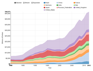
Looking at the screenshot on the left, you can see an App running in the Gallery with a NVD3 chart. In that particular screenshot, my mouse is over the US in 1995 so NVd3 displays a popup with the relevant information at that point. You can also click on the modes (Stacked, Stream & Expanded) to show different views and you can click on the countries at the top, or in the graph itself to only show a subset of the data. This is how NVD3 is designed to run. Continue reading
Alteryx: HTML5 Visualizations
 Last week I introduced potentially new visualizations for Alteryx based on HTML5 and its associated parts like JavaScript and SVG. I started with a macro to write JSON data files from Alteryx. This week I continue the prototype with a macro to actually render HTML 5 into an Alteryx report.
Skipping to the end of the story, on the left is a chart created using nvd3 in Alteryx. I found some nice sample data for visualizing from the world bank showing the GDP of every country (and region) in the world since 1960. The selected data I chose to show is the top 10 countries by GDP since 1980 – the data before then seems to be lacking in some detail. I show the data as a stacked bar chart, which means that the top line is the total GDP for all 10 countries with each country’s part of the total shown by the height of a specific color. Continue reading
Teaching Science to Kids: MythBusters
 Our kids love the MythBusters. We don’t have cable TV, but we do have Netflix, and they are happy to watch Mythbusters as long as we will let them. This week the Denver Museum of Nature and Science opened MythBusters: The Explosive Exhibition. Being members, we were invited to go to the special opening where we got to meet Kari and Tory. The kids were so excited they could barely contain themselves. Kari and Tory were so kind to our kids – they really were wonderful. I am happy to hold them up as role models for our kids. Continue reading
Inspiring Ingenuity
 A few years ago, Alteryx had a tag line “Inspiring Ingenuity.” I loved it and saw it as my goal to inspire ingenuity in the users of Alteryx. I even went as far as to make bike jerseys that prominently feature the phrase. It turns out that customers and prospects didn’t like it as much as us developers… That makes sense because while we are trying to inspire ingenuity, you (the users) are trying to get some work done efficiently. Continue reading
Alteryx: JSON Data Output
I am working on a prototype for Alteryx of some new charting/visualization ideas. For most prototypes we do the audience would be strictly internal, but this time I am going to try something different. As I move forward developing the prototype, I am going to be sharing it with the readers of this blog in order to get as much feedback as I can as early as possible in the process. The idea is to use JavaScript & SVG for visualization/charting from within Alteryx. We could of course extend the charting tool we have, but there is a lot of energy in the open source world right now going on with JavaScript visualization. We want to evaluate the idea of utilizing some of the work that other people are doing – otherwise known as standing on the shoulders of giants. Some of the specific libraries we are looking at include: D3, NVD3 and RAW. There are many, many others, so if we were to integrate a JavaScript engine in a generic way, we could open up Alteryx to all kinds of cool things. Continue reading
Mountain biking with kids

Today is (or was) IMBA’s Take a Kid Mountain Biking Day. I usually don’t pay any attention whatsoever to these kinds of made up holidays, but really, this is as good an excuse as any other to go mountain biking. It doesn’t take much for Nathalie & I. Continue reading
Food Desert – Follow Up
 I had a few follow on requests from yesterday’s post… The 1st was for a map of Alaska. I feel a little guilty for not including it in the first place, but it is difficult to make an aesthetic map that includes the contiguous states and Alaska and Hawaii (I would be remiss at this point if I didn’t include that too.) I made them both pretty high resolution, so I changed the scale so 1 dot equals 50 people instead of 500 for the national map. Continue reading
Alteryx: Big Data and Current Events
Or a National Summary of Food Deserts
 Food Deserts, areas that are a longer than normal distance to grocery stores, have been an ongoing topic in politics and demographics for a while now. I first heard about the concept when Rahm Emanuel started talking about it in his run for mayor of Chicago. I have continued to see articles and blog posts about it and every time I think that Alteryx would make it much easier to create a more nuanced analysis.
They say a picture is worth a thousand words, so I wanted to start with a map. As I explored in Dot Density Maps, mapping a phenomenon that without exaggerating rural areas can be very hard. Look at some of the other maps online: here, here, here, etc… They all show the problem seemingly as a rural problem. To be fair, a lot of blogs are looking at it from a socioeconomic or health point of view and rural areas do play a large part. In the map on the left (click for a larger version) each dot represents 500 people in a Food Desert. It becomes clear that the issue is primarily a suburban issue. There is a ring around almost every city of food desert. From an environmental point of view, this is a disaster. It becomes impossible to walk or ride a bike to get food, so that much more gas is burned and that much more time is wasted sitting in traffic.

