Updated on 2020-03-29 with the latest data and minor style changes.
Once again, I had thought that I was done blogging about either Alteryx or COVID-19… But then the New York Times had to go creating an awesome data set – which you can find here. It is the only data set I have found that has county level data going back to the beginning of the pandemic.
My daughter, Calais Harding, helped me build the maps – it is very time consuming to get right. This time I wanted to make a thematic map that showed both cases and deaths. The trick for doing that – with Alteryx or any other mapping package – is that the thematic ranges have to be set once and reused for all the maps. In this case, that meant we had to use manual tiles. We also picked some colors anticipating future growth in the data. Hopefully it won’t grow too far!
For deaths, we chose to go the blob route. There is a second layer themed on the absolute number of deaths overlaid on top.
Finally, the animated GIF was getting to large for online platforms, so we used ffmpeg to convert to an MP4 this time and upload to YouTube. This really shows the flexibility of Alteryx that you can accomplish all this with 1 click of the run button.
The Alteryx workflow can be found here. And the original high res MP4 without the YouTube processing can be found here.
I often see maps in the news that I find extremely lacking. I considered showing some particularly shameful maps, but the world has enough negativity in it right now. I am hoping that I can teach by example and show some nice techniques and maybe in my small way change the conversation.
Designing maps that display data clearly and honestly is exceptionally difficult. At first it seems so easy, but there are so many ways to go wrong. For example, we have all seen the political maps that make the entire country light up in one color, even though the candidate of the other color won the popular vote. In this particular case, the map is mistaking land area for popular support. If only mountains could vote.
So in general, whenever you paint a map with colors, be careful not to just make a plot of land area. Generally you can do this in 2 ways.
Plot a rate or a ratio or something similar.
Make all the geographies the same size (see here or below.)
Either, it takes land area out of the equation making a rural area on equal footing with a city. In the below map, I chose to show the rate of infections per 100,000 people. I feel that it is very easy to understand and conveys a very accurate picture of the problem facing our country. This is among the simpler maps that Alteryx can do and should be the default type of map unless you have another idea.
So where did the above map fail? It has a difficult time showing the intensity of the problem in New York City. The city (as as today, March 24th) is nearing a 1% infection rate! It is really horrifying. We could make the colors brighter or darker, but since the city is so small on the scale of things, that doesn’t help very much. Really the only way to address this is with physical scale. Many maps will paint blobs all over the map. In order to have the visual impact needed, they need to be quite large. Unfortunately, this means they almost certainly will overlap
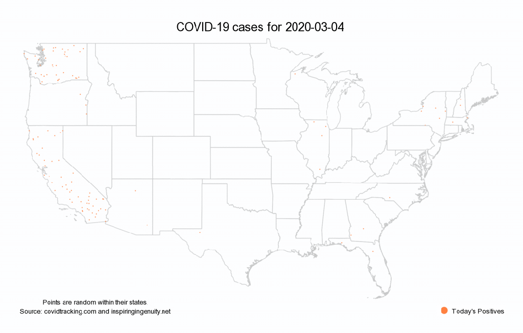
So for the next map, I am making 2 changes. The first is that I am going to show a dot for each person that is currently infected with COVID-19. This is easy to understand. Since I don’t have actual point data of the real people being infected, I am picking a random point in their state. Going out to the state level leaves more room to disperse the NYC points and show the severity of the problem.
The other major thing that I changed is adding movement. Our eyes are amazing at picking out movement and that really helps draw us in to where the problem is. Did you know Alteryx can do animated maps? It sortof can’t, but its not that hard. This is a batch report writing to all separate PNG files that I combined with Image Magick. But since Alteryx can run command line tools it all happens seamlessly with one click of the run button.
Update – new data for 2020-03-22 Lots more cases and older people getting hit harder than ever.
Update – new data as of 2020-03-21 It shows that it continues to big a big problem for the older population.
Wow – I did not think that I was ever going to be writing another Alteryx blog post… I have been out of day to day operations for a few years and starting this year I have no association with Alteryx at all. However, it is still the best data analysis tool out there and Alteryx has been kind enough to let me keep a license. If you just want the conclusion, here is my Colorado COVID-19 report.
Like everyone, I have been obsessively following the COVID-19 data. We are all scared. Colorado has upped its game on data reporting for this crisis with this portal: https://covid19.colorado.gov/data In particular though, I have a few issues with it. While Tableau produces very nice looking charts and maps, Tableau is not the best way to publish high volume data. The site is crashing periodically and having various issues. If you look at the # of network requests it takes to serve up this one page, it is insane. I have argued for years that static reports are generally more appropriate than interactive for this reason among many. But if the report was just a static PDF, it would make it much easier to put on a content distribution network.
My second issue with the Colorado was one particular chart. The reported positive tests by age just end up looking like an age histogram of the state. I was afraid that this diminished the threat of this virus to older people. See the chart below (copied from https://covid19.colorado.gov/data on 2020-03-21):
It kind of makes it look like there is no problem with the older crowd. I found this hard to believe. I am not an expert on data visualization (I am a software architect/programmer). But I do know a thing or 2. Most importantly is that reporting absolute numbers can often be misleading. It is always better to normalize values. In this case a chart with infection rate instead of raw #’s paints a very different picture:
In this case it is very obvious that older individuals are not getting this disease at a lower rate. And the hospitalization rate for older individuals is very high.
So long story short, I decided to make my own static report on COVID-19 for the state of Colorado. I used the data from the Colorado open data portal: here. This data seems to be 1 day out of date for Colorado. I also wanted to add some national data charts which I got here. Because of the nature of the update schedule, this data seems to be 2 days out of date. And finally the age breakdown data for Colorado does not seem to be anywhere for download, but it was a small enough amount of data that I just typed it in. This would all be very easy to adapt for your own state. For obvious reasons, Colorado is where I am interested right now.
Footnote: thoughts about Alteryx now that I am a few years removed from it (note: many of these issues are probably originally my fault, I am not placing blame):
The download tool temporary file mode is not really documented. Being a few years out it took me a few minutes to figure out how to follow that with a dynamic input tool. That should be easier and better documented. It makes it really easy to read a CSV from the web.
The interactive chart needs an option to have a logarithmic scale. Especially for this data.
Why is the chart tool in pixels when the other report tools are in inches/cm? And why does it default to 72dpi when the rest of the report tools (and windows in general) default to 96dpi? And what’s up with LaTeX? And finally – it doesn’t work sometimes if you haven’t run your workflow recently. It would be awesome if it told you that.
Getting all the tools lining up and connections not intersecting is as hard as ever.
I have a fairly big laptop screen, but with almost requiring the config and output windows up all the time, you have a very small amount of work area left. And it still doesn’t support high resolution screens very well.
Tabs within tabs within tabs. All with different styles to try to make you think you aren’t in tabs.