A few people have been using the macro I wrote about in Alteryx: Wildcard Inputs, but have an issue with XLSX files. The first thing to remember is that these macros I post (on my personal blog) are examples only and are not a supported part of the product. I am happy to give people advice on how they might take what I did and extend it. However, in this case, I thought it might make a good post about Alteryx macros with optional parameters, so I went ahead and did it anyway. Continue reading
Tag Archives: macro
Alteryx: Aggregate Formulas
 One of the really great strengths of Alteryx is that is can handle any amount of data that you throw at it. If your data is small enough, it might all be in memory, but when Alteryx gets more data than fits, it silently swaps out to disk. This way people are routinely processing data sets that are 2, 10 or even 100 times bigger than they have enough memory for!
Mostly the user never notices this aspect of the Alteryx engine and it just works. There are times though when we get feature requests that would be much easier to implement if all the data was in memory. One example of that is aggregate functions in the formula tool. Since other desktop products that are similarly easy to use, like Tableau and Excel, have simple SUM and AVG type functions in their formulas, it is assumed that Alteryx would too. Continue reading
Alteryx: Optimizing Modules for Speed
One of the most common questions I get about Alteryx is: “How can I make my module run faster?” Although Alteryx can be very fast, since it is such a general tool, it is only as good as the module that you have authored. There is a very simple guideline that you can follow to make a module faster: do less work. The most common example of doing less work is to use the select tool as early as possible to remove fields that you are no longer using. In order to walk you through the process I use to make an Alteryx module run faster, I am going to walk through the process of optimizing my Percentile Macro to run as fast as possible.
Alteryx: Percentile Macro
Update – there is an updated version of this macro in the post: Alteryx: Optimizing Modules for Speed.
There was a recent question on the Alteryx forum: How to use the percentile in summarize. The question misunderstands the percentile function in the summarize and is looking for something slightly different, although with similar math. So what does the percentile in the Summarize tool do? From the help:
Percentile: Calculates the specified percentile value for the group. The percentile is calculated by sorting the data and returning the row value relative to the specified percentile and its position in the sorted array – the largest value is the 100th percentile, lowest value is the 0 percentile, median is the 50th percentile, the 25th percentile is the value in the middle of the median and minimum, etc.
Alteryx: Skip Last N Records
Sorry for the lack of posts the last few weeks – I have been busy few weeks heads down working on a futures project (code named LockIn.) I went as far as turning off email and IM to get some real focus. It was very productive – I haven’t produced that much code in a while.
Anyway, this week I have a very quick post answering a question from the Alteryx forums. The questions asks: How do I skip the last N records from a data stream. Skipping the 1st N is very easy, just use the sample tool, but it doesn’t have a mode to skip the last N. Continue reading
Alteryx: Wildcard Inputs
There is now an update to this post at: Alteryx: XSLX Wildcard inputs – read both to see how it comes together.
Wow, what a conference that was last week! I loved meeting all kinds of amazing customers in the Solutions Center and getting all kinds of product feedback, as well as being able to help people solve their problems. In particular, if you haven’t seen it, check out Adam’s Blog Macro Pack. He took a bunch of macros from this blog as well his and Chris Love’s and packaged them up with a cool installer so they show up in your tool palate.
![]() Much of the feedback is already under consideration by product management and some of it has already been put on the development teams backlogs for Alteryx 9.1. There was one request in specific though that is actually much easier to implement as a macro then it would be as a native tool. The customer asks:
Much of the feedback is already under consideration by product management and some of it has already been put on the development teams backlogs for Alteryx 9.1. There was one request in specific though that is actually much easier to implement as a macro then it would be as a native tool. The customer asks:
While I know that the input tool will accept a wildcard, it fails if the schemas are different. How do a read a set of files using a wildcard when the schemas don’t exactly match?
Alteryx: Spatial Data Output (GeoJSON)
Continuing the series prototyping HTML based visualizations, I want to look at spatial data. One of the strengths of Alteryx is that spatial data is just data. It doesn’t claim to be a GIS product, it just assumes that every organization has spatial data and would like to process it with the rest of their data and specifically they don’t want to have to use multiple products to do it.
So far in my prototype I have ignored spatial data. Clearly if we decide to add new visualization features in Alteryx, spatial needs to be a 1st class part of it. Since this prototype is entirely based on HTML and JavaScript, we need to start with what spatial data looks like in that environment. Fortunately, there is already a standard for spatial data in JSON: GeoJSON.
Alteryx: HTML5 Visualizations
 Last week I introduced potentially new visualizations for Alteryx based on HTML5 and its associated parts like JavaScript and SVG. I started with a macro to write JSON data files from Alteryx. This week I continue the prototype with a macro to actually render HTML 5 into an Alteryx report.
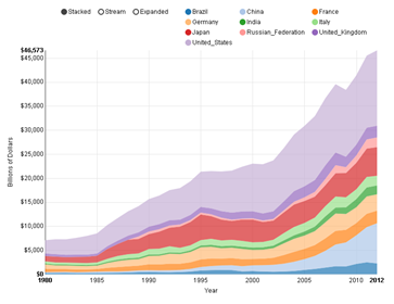
Skipping to the end of the story, on the left is a chart created using nvd3 in Alteryx. I found some nice sample data for visualizing from the world bank showing the GDP of every country (and region) in the world since 1960. The selected data I chose to show is the top 10 countries by GDP since 1980 – the data before then seems to be lacking in some detail. I show the data as a stacked bar chart, which means that the top line is the total GDP for all 10 countries with each country’s part of the total shown by the height of a specific color. Continue reading
Alteryx: JSON Data Output
I am working on a prototype for Alteryx of some new charting/visualization ideas. For most prototypes we do the audience would be strictly internal, but this time I am going to try something different. As I move forward developing the prototype, I am going to be sharing it with the readers of this blog in order to get as much feedback as I can as early as possible in the process. The idea is to use JavaScript & SVG for visualization/charting from within Alteryx. We could of course extend the charting tool we have, but there is a lot of energy in the open source world right now going on with JavaScript visualization. We want to evaluate the idea of utilizing some of the work that other people are doing – otherwise known as standing on the shoulders of giants. Some of the specific libraries we are looking at include: D3, NVD3 and RAW. There are many, many others, so if we were to integrate a JavaScript engine in a generic way, we could open up Alteryx to all kinds of cool things. Continue reading
Alteryx: Dot Density Maps
As well as tips for writing reusable macros…
I have been continuing down my path of writing a general interest post about Food Deserts. Most maps you find online of Food Deserts, or any other phenomenon that happens primarily in rural areas make the issue look much larger than it really is. Looking at a map of the 2008 US presidential election, you would never guess that the blue team won. Rural areas are a larger portion of the map than they are of the people and so it is very easy to create a misleading map. I wanted to explore mapping methodologies that properly shows the scope of an issue – not exaggerating it by making it look bigger or smaller than it actually is. You can click on all the maps in this post for a larger version.
