 Last week I introduced potentially new visualizations for Alteryx based on HTML5 and its associated parts like JavaScript and SVG. I started with a macro to write JSON data files from Alteryx. This week I continue the prototype with a macro to actually render HTML 5 into an Alteryx report.
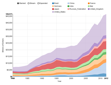
Skipping to the end of the story, on the left is a chart created using nvd3 in Alteryx. I found some nice sample data for visualizing from the world bank showing the GDP of every country (and region) in the world since 1960. The selected data I chose to show is the top 10 countries by GDP since 1980 – the data before then seems to be lacking in some detail. I show the data as a stacked bar chart, which means that the top line is the total GDP for all 10 countries with each country’s part of the total shown by the height of a specific color. Continue reading