Update 2020-03-26 – updated animated map
I often see maps in the news that I find extremely lacking. I considered showing some particularly shameful maps, but the world has enough negativity in it right now. I am hoping that I can teach by example and show some nice techniques and maybe in my small way change the conversation.
Designing maps that display data clearly and honestly is exceptionally difficult. At first it seems so easy, but there are so many ways to go wrong. For example, we have all seen the political maps that make the entire country light up in one color, even though the candidate of the other color won the popular vote. In this particular case, the map is mistaking land area for popular support. If only mountains could vote.
So in general, whenever you paint a map with colors, be careful not to just make a plot of land area. Generally you can do this in 2 ways.
- Plot a rate or a ratio or something similar.
- Make all the geographies the same size (see here or below.)
Either, it takes land area out of the equation making a rural area on equal footing with a city. In the below map, I chose to show the rate of infections per 100,000 people. I feel that it is very easy to understand and conveys a very accurate picture of the problem facing our country. This is among the simpler maps that Alteryx can do and should be the default type of map unless you have another idea.

So where did the above map fail? It has a difficult time showing the intensity of the problem in New York City. The city (as as today, March 24th) is nearing a 1% infection rate! It is really horrifying. We could make the colors brighter or darker, but since the city is so small on the scale of things, that doesn’t help very much. Really the only way to address this is with physical scale. Many maps will paint blobs all over the map. In order to have the visual impact needed, they need to be quite large. Unfortunately, this means they almost certainly will overlap
So for the next map, I am making 2 changes. The first is that I am going to show a dot for each person that is currently infected with COVID-19. This is easy to understand. Since I don’t have actual point data of the real people being infected, I am picking a random point in their state. Going out to the state level leaves more room to disperse the NYC points and show the severity of the problem.
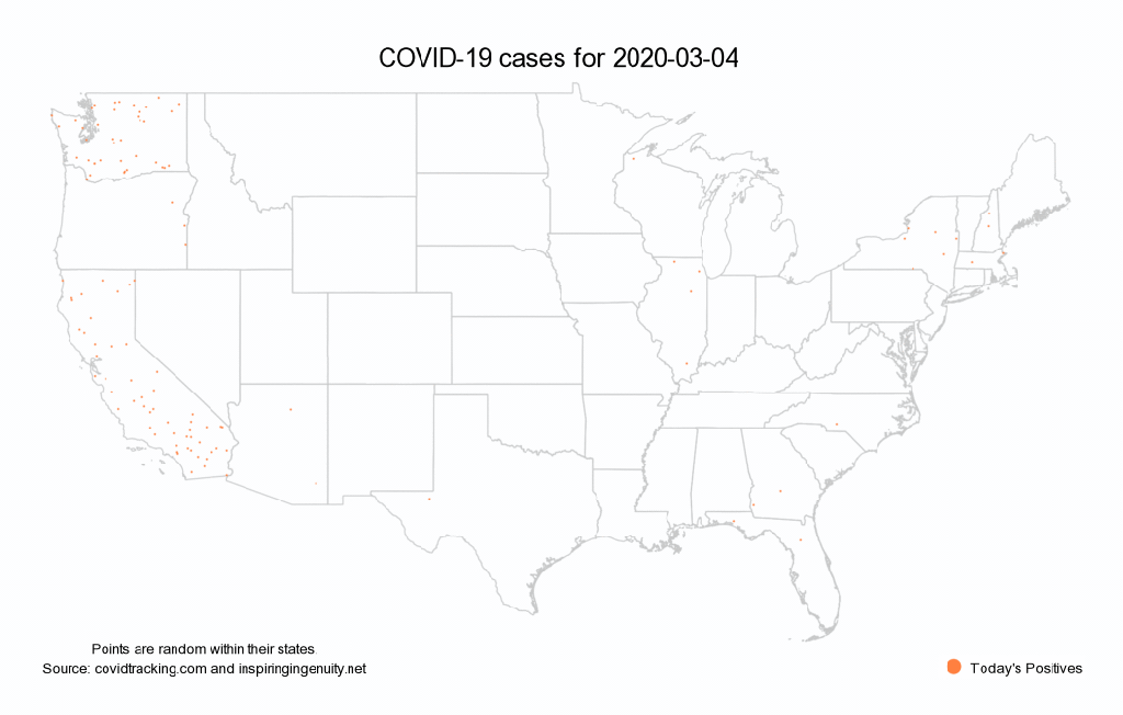
The other major thing that I changed is adding movement. Our eyes are amazing at picking out movement and that really helps draw us in to where the problem is. Did you know Alteryx can do animated maps? It sortof can’t, but its not that hard. This is a batch report writing to all separate PNG files that I combined with Image Magick. But since Alteryx can run command line tools it all happens seamlessly with one click of the run button.

March 25, 2020 at 1:49 am
Thanks for the demonstration Ned. Still taking me to school.
March 25, 2020 at 2:31 am
Ned, this is brilliant as usual. I wonder if, in order to make a compelling case against those who claim the response is worse than the cure, we could look at shify in violent crime stats and/or suicides to see how the layoffs are impacting things? Are anecdotal cases being raised in some corners more than just anecdotes…? Also, I wonder if we tried a graduated shading approach (zero deaths is bright green, varying to dark red as death toll increases to, say, 1% percentage of the population or more, also for each county). Then the same for case counts, and both maps over time with your ImageMagick trick. For now large swaths would still be bright green, but seeing the gradual spread throughout the country would be valuable. Anyway, just some thoughts. Thanks for the brilliant viz’s – I’ve already shared extensively.
March 25, 2020 at 6:42 am
Hey John – Yes, you could totally do that. The one thing you would have to do is to use manual tiling ranges. If you let software pick the ranges automatically (like the Alteryx SmarTile) then the colors would be shifting every day and it would break the illusion of the animation. The difficult part of course is that you will have to pick the ranges based on future data that you don’t know yet. The other problem is that the historical data for counties is not very good at this point. Anyway in short, a friend of mine is working on exactly that map. I will send it out if he succeeds.
March 25, 2020 at 12:17 pm
The main issue with spreading out New York’s infections and deaths over the entire state is that it makes it look like the entire state is a hot spot when most of the counties have infections in the single digits or even 0. Seems like a good case for using markers that are sized to scale with the number of infections and then color coded to show the infection rate.
March 26, 2020 at 8:23 am
Very insightful, Ned. I am glad you are blogging again. “If only mountains could vote.”