 As I am drawing to a close in exploring interactive charting in Alteryx, I wanted to create a macro for the people who say “Can’t I just have it now?” One of the great things about Alteryx is the macro system and the fact that you kind of can have it now. Once again, I am wrapping the NVD3 library as a starting point. The macro has 4 different chart types exposed: Line, Bar, Area and Scatter Plots. I produced samples for the 1st three. NVD3 supports lots more types of charts, but most of the rest take more specific user input or only work for a limited number of dimensions.
 For this example I wanted to keep it simple. Obviously if we were to actually productize a charting system like this, there would be lots more options, and probably not even limited to NVD3.
Tag Archives: HTML5
Alteryx: Spatial Data Output (GeoJSON)
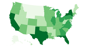
Continuing the series prototyping HTML based visualizations, I want to look at spatial data. One of the strengths of Alteryx is that spatial data is just data. It doesn’t claim to be a GIS product, it just assumes that every organization has spatial data and would like to process it with the rest of their data and specifically they don’t want to have to use multiple products to do it.
So far in my prototype I have ignored spatial data. Clearly if we decide to add new visualization features in Alteryx, spatial needs to be a 1st class part of it. Since this prototype is entirely based on HTML and JavaScript, we need to start with what spatial data looks like in that environment. Fortunately, there is already a standard for spatial data in JSON: GeoJSON.
Alteryx: Interactive HTML Visualizations
In the last 2 weeks, I have introduced (as a prototype) the idea of embedding HTML visualizations into Alteryx. If you have not read them you can read Part 1: JSON Data Output and Part 2: HTML5 Visualizations. In last week’s post, I explored a generic HTML 5 output tool and a sample visualization based on NVD3. Although I was able to return a very nice visual from NVd3, all interactivity was lost. This week I want to show a prototype with the interactivity working the way it should in NVD3.
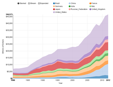
Looking at the screenshot on the left, you can see an App running in the Gallery with a NVD3 chart. In that particular screenshot, my mouse is over the US in 1995 so NVd3 displays a popup with the relevant information at that point. You can also click on the modes (Stacked, Stream & Expanded) to show different views and you can click on the countries at the top, or in the graph itself to only show a subset of the data. This is how NVD3 is designed to run. Continue reading
Alteryx: HTML5 Visualizations
 Last week I introduced potentially new visualizations for Alteryx based on HTML5 and its associated parts like JavaScript and SVG. I started with a macro to write JSON data files from Alteryx. This week I continue the prototype with a macro to actually render HTML 5 into an Alteryx report.
Skipping to the end of the story, on the left is a chart created using nvd3 in Alteryx. I found some nice sample data for visualizing from the world bank showing the GDP of every country (and region) in the world since 1960. The selected data I chose to show is the top 10 countries by GDP since 1980 – the data before then seems to be lacking in some detail. I show the data as a stacked bar chart, which means that the top line is the total GDP for all 10 countries with each country’s part of the total shown by the height of a specific color. Continue reading

